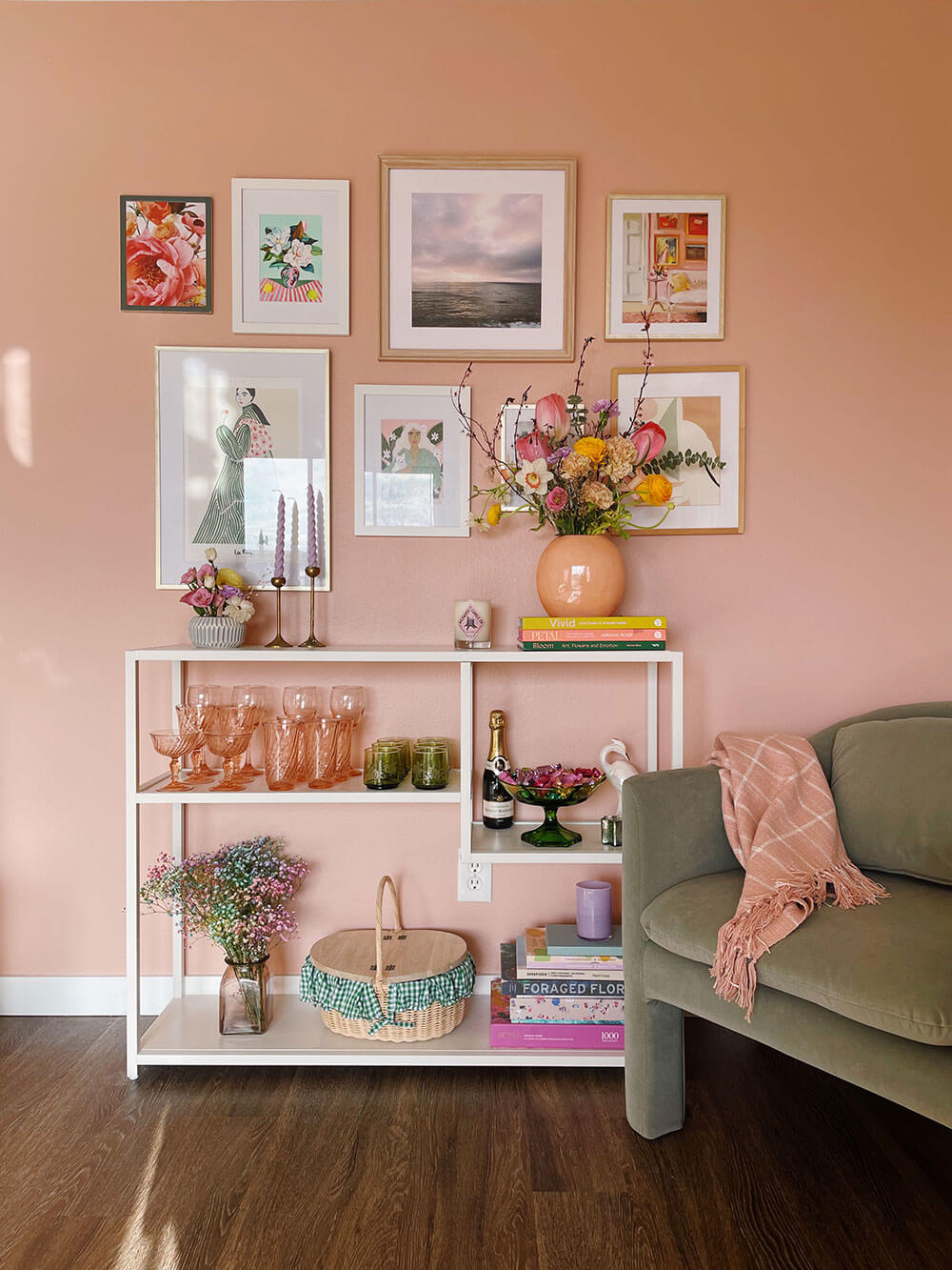
It’s ever so slowly starting to feel like spring, but for now I’m happy hanging inside (with all the blinds up, of course) because I finally finished the pink accent wall project I’ve been dreaming up for many moons! I’m an interior paint novice, but there are just too many white walls in this apartment of ours. I decided months ago that it needed a pop, preferably pink, but it took time to research sustainable paint companies before I found a brand I aligned with and that featured colors I loved. Enter: Clare paint. They agreed to send me two colors + paint supplies to try, and I’m excited to show you the result and a full review in this post!
I’ve always loved how white walls are like a bright blank canvas, but as a conscious maximalist I crave color. We have this west-facing wall opposite our sliding door in our living room which gets tons of light and was just begging to be upgraded. We actually moved in last August and I’ve done nothing with this corner of the room. I finally decided on a simple console table and that it would feature a gallery of framed art. Over the months I collected art and frames (it’s wild how this little collection actually took so much planning!) Once I had a handle on that, I knew that paint was the missing piece!
Sourcing Sustainable Interior Paint
So began my research into what VOCs actually are, paint sustainability, and why I’d go with one paint brand over another. Before I got to the accent wall, I actually touched up some of the trim in our apartment with a mainstream paint. The paint all over this unit is, to put it kindly, less than professional, and the trim had nicks and scratches everywhere. (The walls that I painted over during this project were super unevenly textured too.) That basic paint was what I’d call high odor (haha), I had to be on top of ventilating and tried to breathe in as little as possible. This was a helpful experience because once I got to the Clare paint, I immediately noticed the low odor, not to mention didn’t feel queasy when I got too close to it!
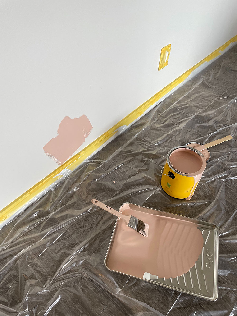
Is Clare paint sustainable? What I liked about Clare was that their paint is not only free of toxins (see below), but they are an eco-conscious company… Even down to their supplies. For example, the paint liners and trays (seen below) are made of recycled materials. Packaging supplies are made of 100% recycled material. And, their paint is LEED compliant. I’ve seen so many companies prioritize human health but disregard their effect on the environment, when the two should really be intertwined.
What are VOCs?
VOCs are a group of carbon-based chemicals (the most common is formaldehyde) present in home construction and maintenance products such as flooring, building materials, and paint. VOCs have been linked to anything from minor irritation while using to cancers caused by long term exposure. As far as I can tell, there isn’t universal guidance for the levels of VOCs that can safely be in a home (where air pollutants can be worse than outside!); the general consensus is simply that you should limit them as much as possible. Apparently, they’re what’s responsible for that “new home” or “new car” smell! No wonder that always gave me a headache…
When it comes to sustainability, some VOCs can act as indirect greenhouse gases in the form of air pollution. VOCs can accumulate in the air and ground water, so they are of concern for both the environment and personal health.
What is GREENGUARD Certification?
GREENGUARD is a certification by safety leader UL Solutions that analyzes products for chemical emissions. This certification process emerged as a way for low-emission companies to let their customers know health and safety is a priority. According to UL Solutions, “If a product has been UL GREENGUARD Certified, it has been tested and scientifically proven to have low chemical emissions.” They test for more than 10,000 chemicals in their labs.
Zero VOC Paint
Clare is GREENGUARD Gold Certified. “Gold” indicates that a brand has even more strict standards as to which chemicals are allowed in their products. (You’ll find that many sustainable children’s brands go the extra mile to get this so that health conscious parents can have confidence in their products.) The Gold certification further limits formaldehyde in particular. (Confession: I’m not sure how much formaldehyde is or should be allowed in any product–certification or not.)
Clare says, Our paint is Zero VOC, which means no carbon-based solvents (VOCs) have been intentionally added to our products, although trace amounts of VOC may be present as residual components of other ingredients.
When researching sustainable paint companies, I found several that advertise low-VOC paint. Clare was one of the only companies I’ve ever heard of that offers Zero VOC paint. They also contain zero EPA chemicals of concern. Comparable paint brands I came across had a higher price point as well.
Trying Removable Swatches
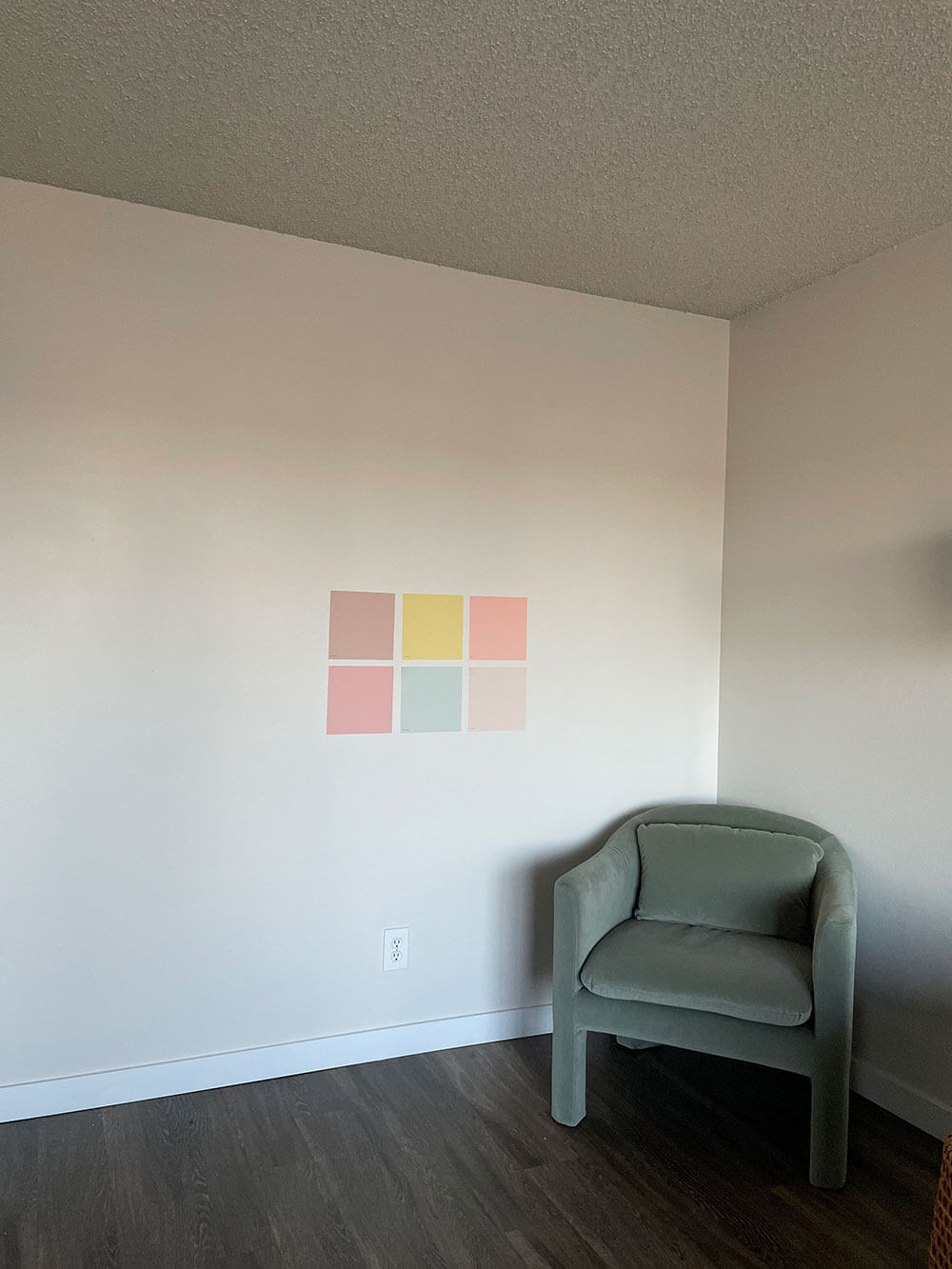
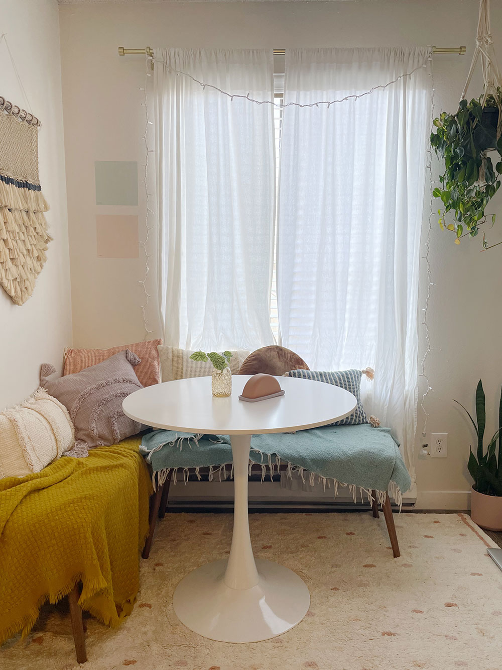
Over the holidays I had my Christmas tree and bar cart in the living room space, but it’s been empty (and driving me bananas) ever since the new year! I tried their removable paint swatches on my blank slate as well as in my dining nook. You can purchase the peel-and-stick paint samples individually or in curated sets (they sent me minty Rain Check + the other swatches shown are from their Sunset Shades kit) which are available with free shipping.
Side note: Before I reached out to Clare I had already ordered a few swatches, Wing It for the pink wall and Headspace + Dirty Martini potentially for my dining nook, which I’ll share more about soon. But they weren’t *quite* right. Miraculously as I was mulling it over I got an ad for their new hue Rain Check, which is an almost neutral green-blue, so I went with that for the nook. More on that later!
Choosing Color
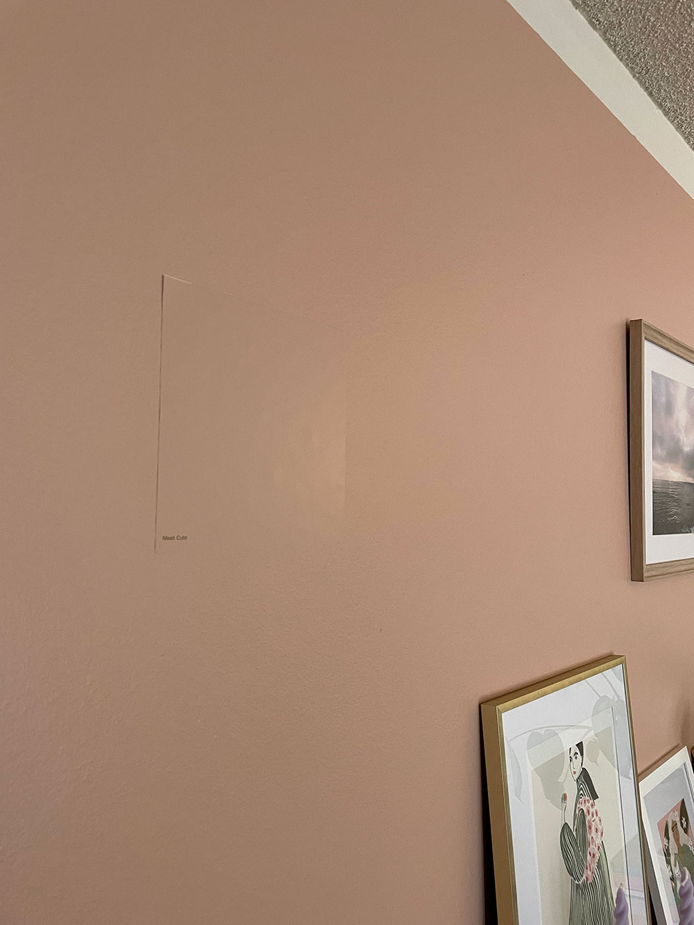
This is an awful photo but I wanted to show how accurate the swatch is! Keep in mind that the color will change throughout the day depending on the light. I had my swatches covering the wall for days before I landed on Meet Cute. Originally I felt Wing It was more my style (I’m a pastel girl at heart) but I was told it seemed too light and baby pink. The Meet Cute swatch looked a bit dark, but of course it was contrasted with near-white. It looked beautiful in the Instagram photos I saw it in. I couldn’t decide, but when Kevin said he liked it better I went with it (he lives here too, after all) and I’m super happy I did. I think anything lighter would look washed out in the sunlight. This makes a statement!
When it came to how much paint is needed for an accent wall, I used their paint calculator and advice on their website. I ordered a gallon because at the time I wasn’t sure if I’d paint other walls with Meet Cute too, but just a quart would have done the trick! I was shocked, as a quart seems like such a small amount, but for two coats it’s totally accurate. This is also great news as opting for sustainable, zero VOC and low odor designer interior paint can come with an increased price tag over some of the mainstream brands, but you can save a lot by only getting what you need.
The Painting Process
The paint arrived quickly and I decided to knock it out over a weekend (one day for this wall). I read the instructions and got started! You can see the process on our Instagram. I was excited to see how quickly their paint dries. It was ready for its next coat in maybe an hour. I also liked their painter’s tape more than the standard blue kind. I used some blue I already hand on hand so I could compare and the yellow sticks better and tears off easier. I must say I’m pretty impressed with my paint job considering I’ve only ever painted a wall once. At least compared to how it was!
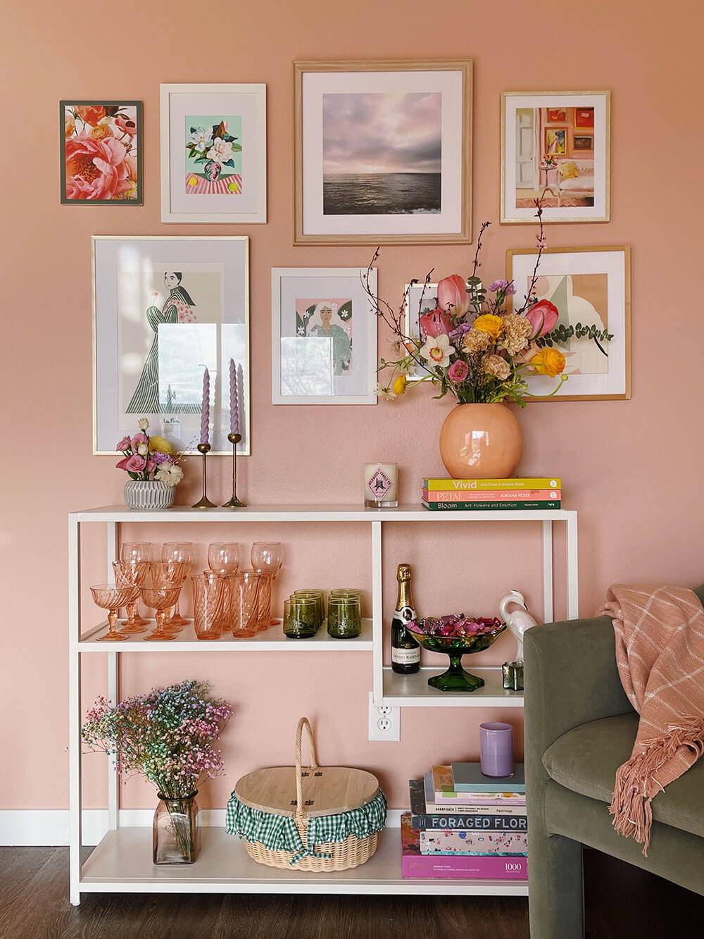
It would likely have helped to hide some of the previous paint job’s imperfections by using their primer, but I’m still happy with the result.
My Gallery Wall
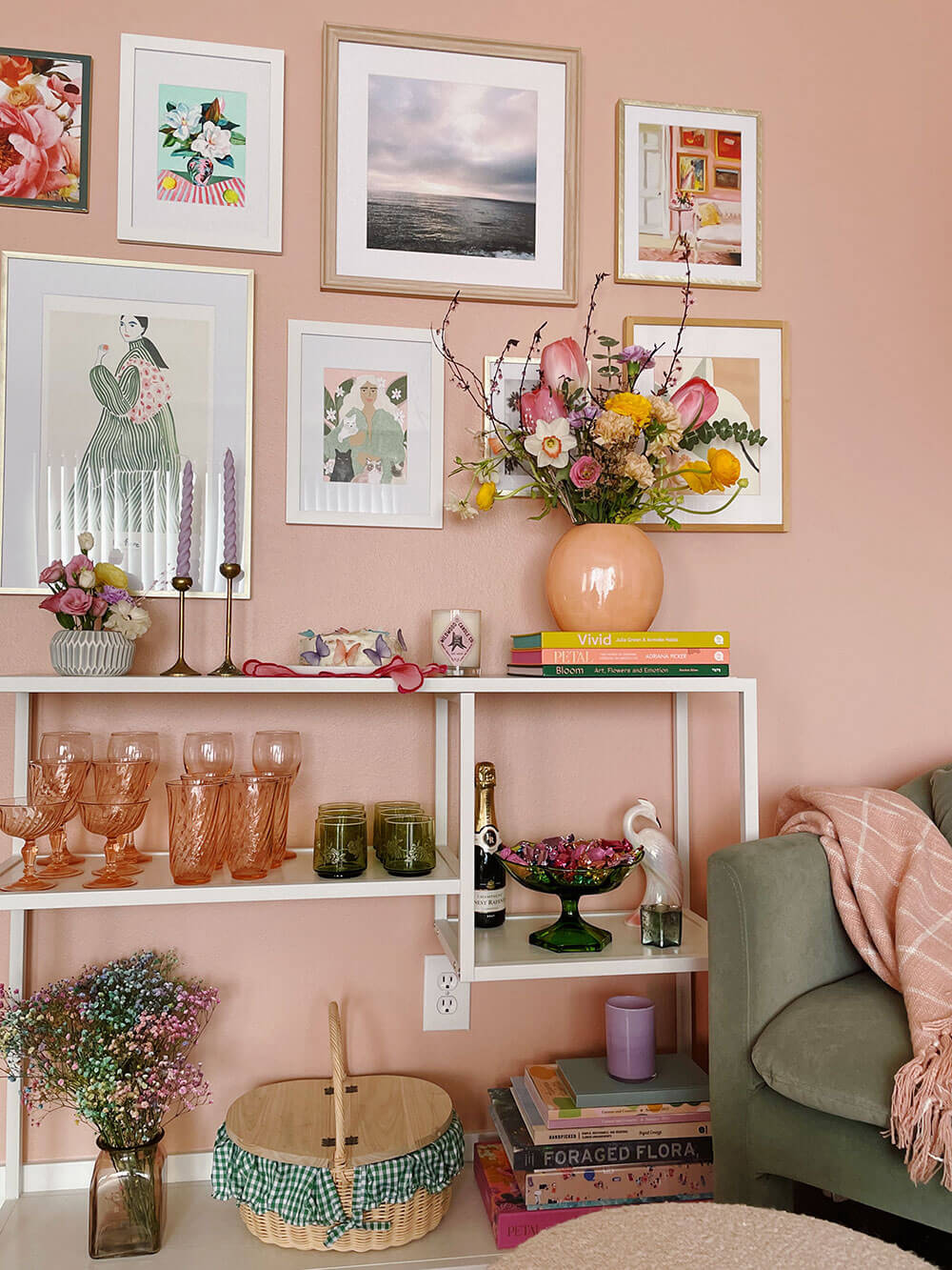
Once finished, I moved my table back and got to decorating! We finally put up the art and photos I’d been collecting. I’ll share sources for the decor pictured below, but on the wall is a mix of art and my personal photos (sunsets and flowers). The frames are a mix of gold, wood, and bamboo, and some cheaper ones I’ve had forever.
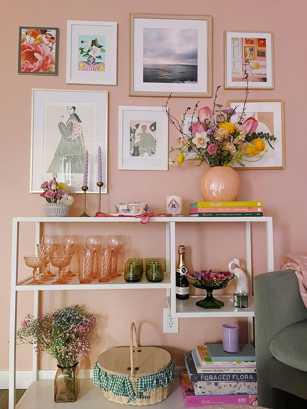
The following week was my birthday, so I shuffled to get this all decorated by time I had a few friends over to celebrate! Hence the bubbly, candy bowl, and too cute to handle butterfly birthday cake by Charity.
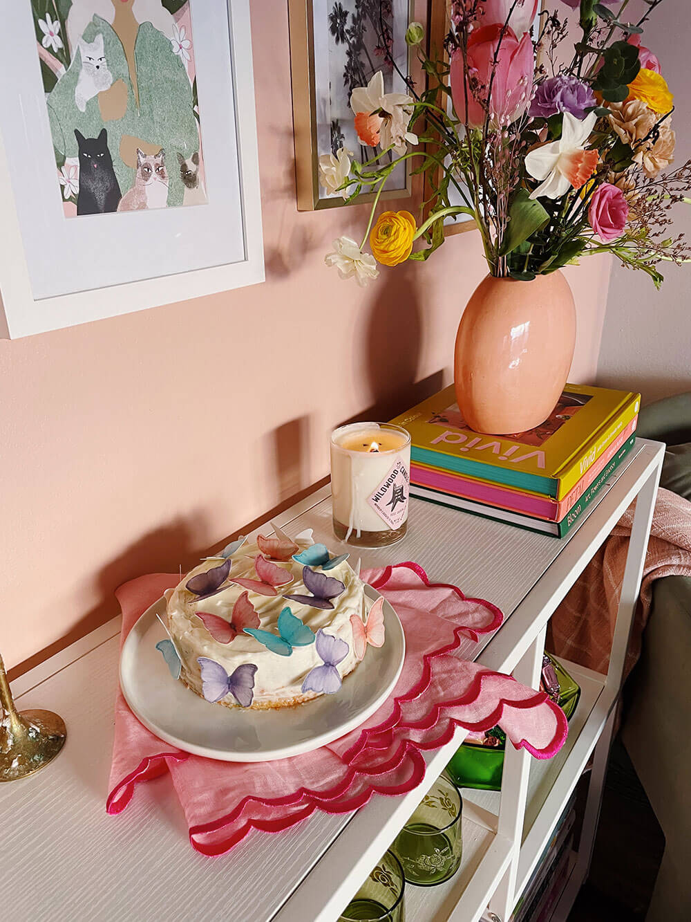
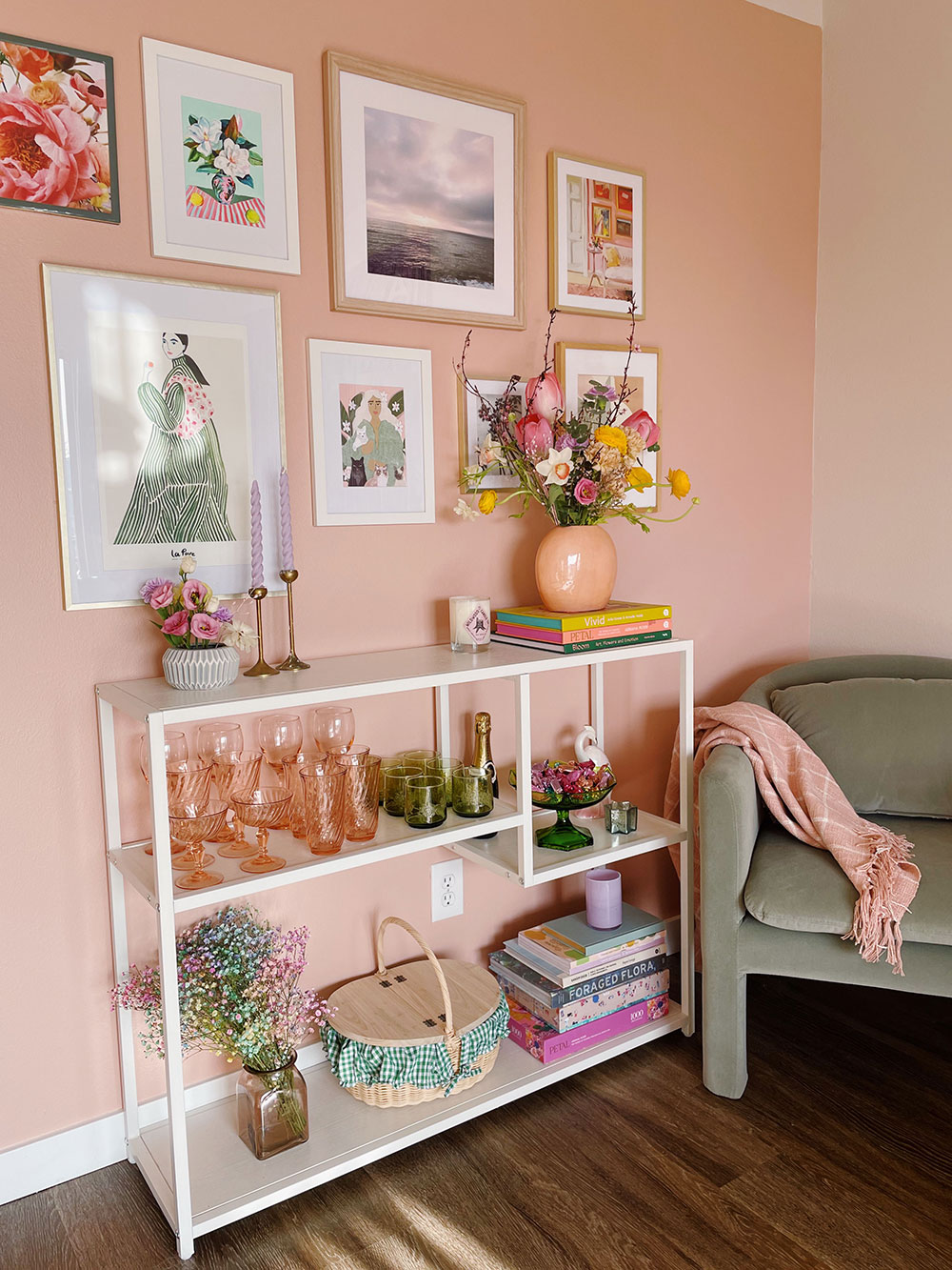
During golden hour the whole place lights up! As you can probably tell, I took these photos at different times throughout the day, which changes the pink hue slightly. I gave all the photos the same minimal edit so you could see the difference.
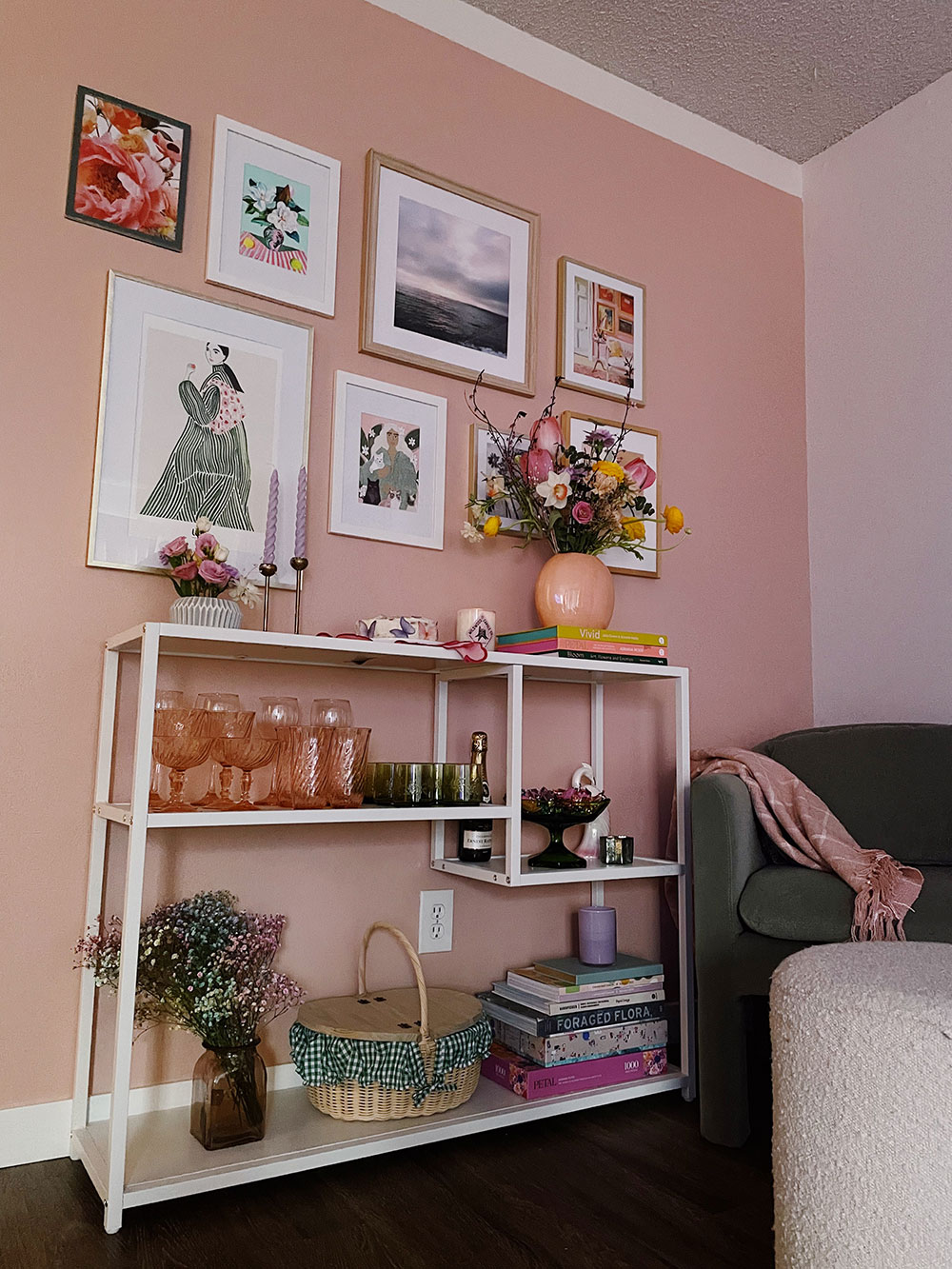
Once the sun set, everything took on a cooler tone. By the way, I kept a strip of the original paint color at the top which mimicked the bottom trim. Would be amazing if we had moulding but alas. I was too nervous to paint right up to the popcorn ceilings and hope it would detract a bit anyway.
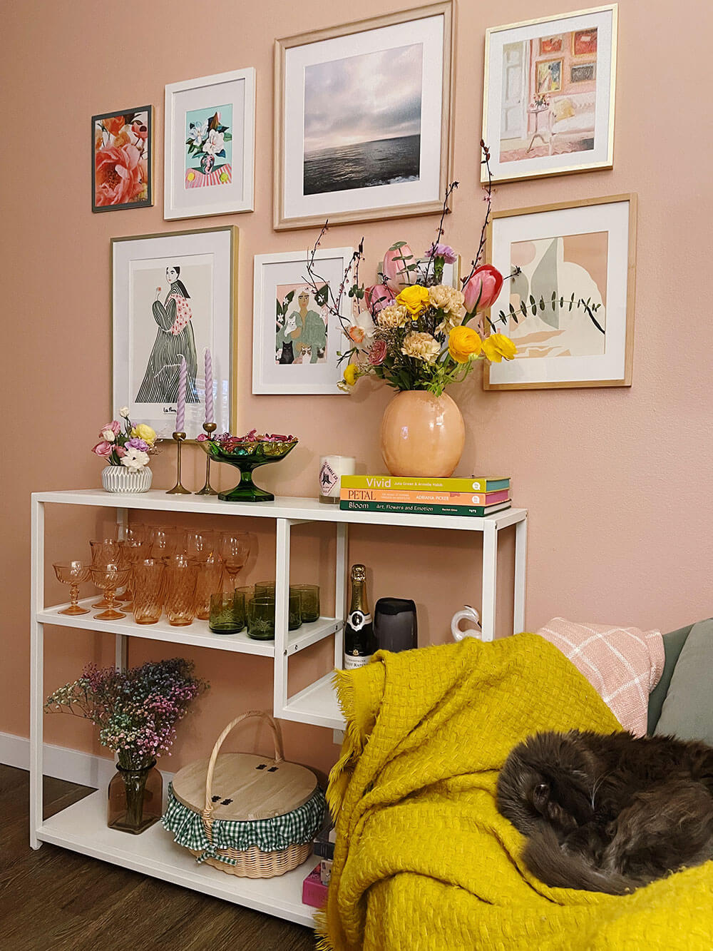
This one was taken at night with the warm light from my living room lamps. See below for the art and decor sources; some of the pieces featured are available in Jenn and my boutique, wallflower!
Sources: Paint, Swatches, and Supplies: Meet Cute from Clare | Candle: Wildwood Candle Co | Twist Candles: Wallflower | Picnic Basket: Wallflower | Truffles: Seattle Chocolate | Vivid Book: Wallflower | Bloom Book: | Vases + Vintage Glassware: Etsy + Thrifted | Cat Lady Print: Alja Horvat | Green Coat Art Print by La Poire: Wallflower | Floral Still Life: Helen McCullagh | Abstract Print: Wilde House Paper | Pink Wall Print: Esther Pai | Petal Puzzle: Wallflower | Pink Throw Blanket: Wallflower | Sage Chair: Target | Cloth Napkins: Wallflower
Thanks to Clare paint for collabing with me on this accent wall project! Meet Cute is the perfect hue for Spring.
obsesseddddd
Wonderful to see a sustainable/VOC free paint out there! I’ve been overwhelmed researching this, but it’s so great to read about and see your experience. Beautiful!
So glad you found our post and I’m happy it helped! There’s definitely a lot to wade through online! Thanks for stopping by. 🙂
Loved it!!